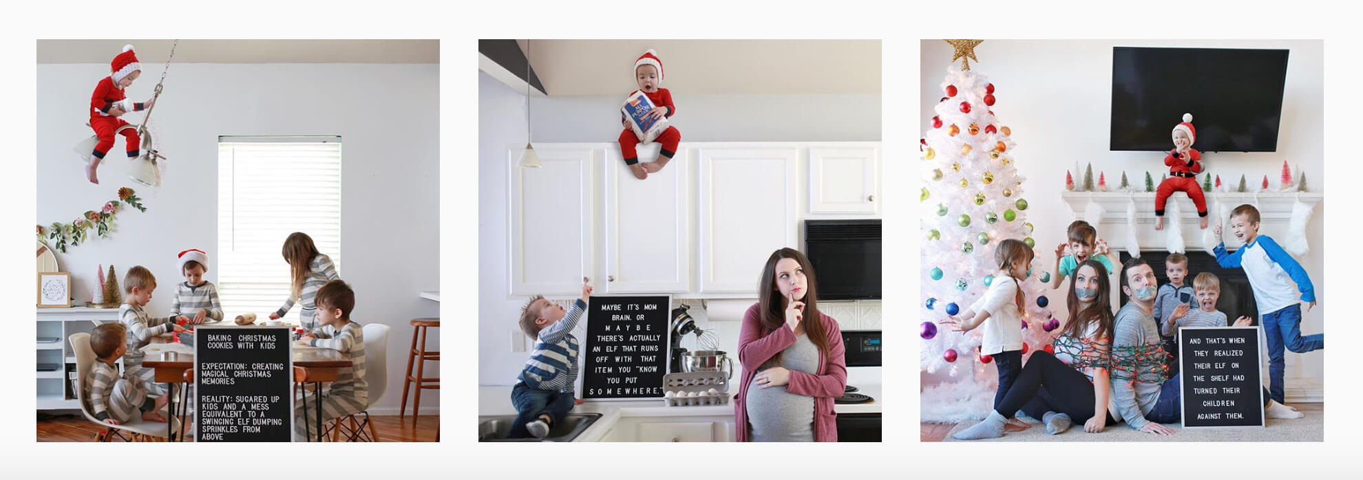
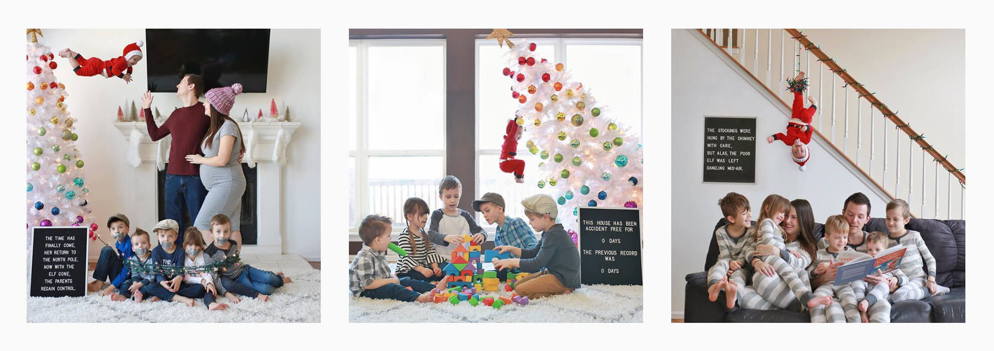
Today’s post is a little different than usual–and that’s because it’s the first time I’ve ever hosted a guest blogger! I happen to know this guest pretty well because I am married to him 😉 I already shared a bit about the ideas behind our Clem on the Shelf pictures. Now Don is going to share a little bit more about the “behind the scenes” of the photos. This is not a tutorial, but it does kind of share how he did it. If you have any more questions or you’d like to see more posts like this, please let us know in the comments! I’ll keep this introduction short and sweet because my husband is as long winded as I am 😉 Enjoy!!
To those of you who don’t know who I am, my name is Don Roberts and I’m Jessica’s husband. When Jessica mentioned that she wanted to do another round of “Clem on the Shelf” this year, I immediately agreed because I remembered how awesome the one from last year was and I knew we could make something really special again this year.
I don’t exactly remember how we came up with the idea to turn our little Clemmie into a mischievous “Elf of the Shelf”, but as we kept bouncing ideas off of each other, they kept getting more and more ridiculous and funny with each new suggestion. Before we knew it, we had a list of six pictures that we knew we had to do. The only problem was that they were actually pretty mischievous elf pictures; to the point of needing some Photoshop magic to make them work.
Now, I’ve pretty much grown up using Photoshop off and on as a hobby for a really long time. I’m not an expert by any means, but I do know enough (and more importantly have a huge drive when it comes to learning things I’m interested in) that I was able to imagine and visualize what needed to be done, and if I didn’t know how to do it, I was excited to learn how to do it via Google/YouTube.
The first Clem on the Shelf picture I pretty much photoshopped on my own with the knowledge and skills I already had at that time, without really putting too much thought into the whole process. After that first picture was done and I started realizing some of the mistakes I had made, and not knowing how to fix them, that was when I decided I needed to resort to some tutorials to teach me the things I didn’t know how to do.
So with that thought in mind, I know a lot of you have asked Jessica in the comments of her Instagram how we pulled off some of the pictures, so I wanted to share some of the major ideas and concepts we used, the challenges, and the things I learned in Photoshop along the way.
After doing this series, I really do feel like my Photoshop skills AND my enjoyment for photography and photo editing have really improved. I hope that some of the things I’ll cover in this post will help you with your pictures, or to at least have a better appreciation for some of the work that goes into making pictures like this.
Problem Areas (What I Needed To Learn)
So the first picture taught me a lot about where my basic Photoshop skills were (and what needed to improve in order to progress through this series). I had no problem selecting and cutting out people/things and placing them into other images. What I quickly found out is that making them look like they actually BELONG in the image (I now know this as the term “compositing” or making a “composite image“) is much much harder, and really an art-form in itself. There is so much to learn about compositing, that I have a feeling I’ll be spending a lifetime of editing pictures before I feel like I’ve truly “nailed it”.
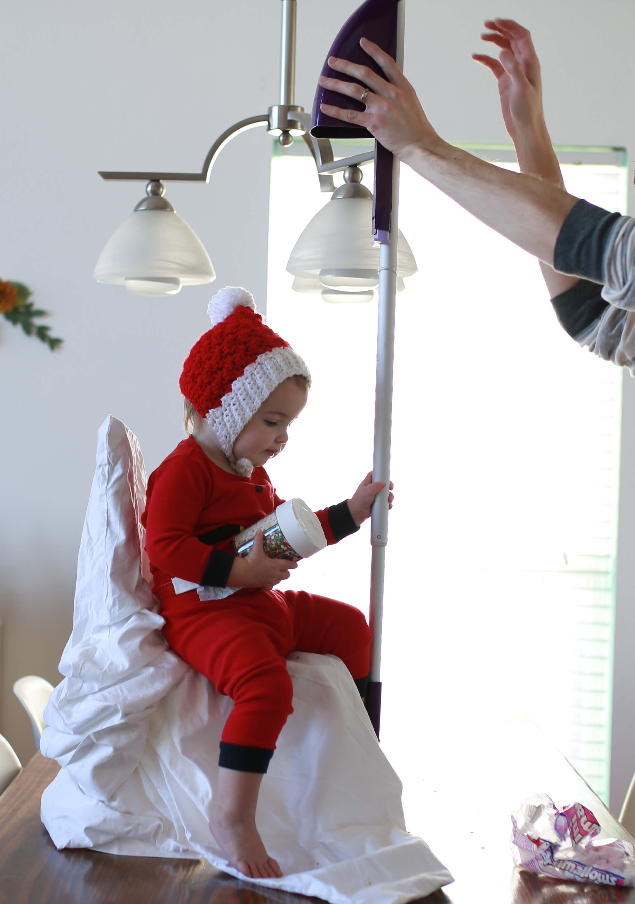
Anyway, the first Clem on the Shelf picture (remember the one with me relying on my previous knowledge?) I thought that it would be best to try and add some blurring on Clem to make her fit in. Cutting her out left some pretty sharp edging around her, so using some blur should help, right?
Well, I think I’ve learned now that it really just depends on the picture itself, and the context of your foreground, background, and what is actually in focus/what is naturally blurred through your camera and lens. To explain that point a little clearer, to seem like she belonged, she needed the same amount of blurring that the area she was in had.
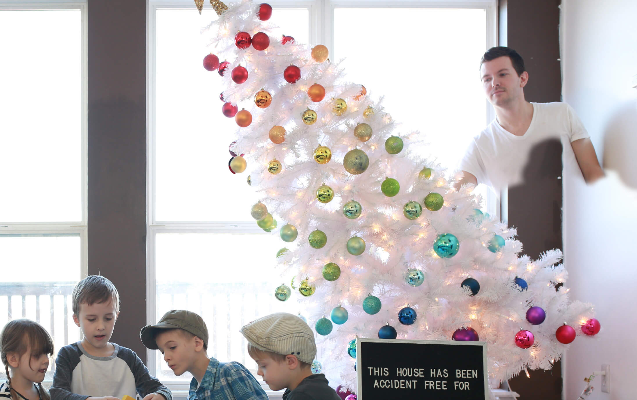
As you can see in the picture below, I way overdid the blurring here. While it is true that Liam is in front of Clem in terms of foreground/background, and should have been sharper, Clem should not be blurred that much haha. The mantle that she is sitting on, in theory, should have the same level of (natural) blur because they are occupying the same area in terms of distance from the camera. I should have based my blur of Clem from the mantle/trees/stockings. Whoops!
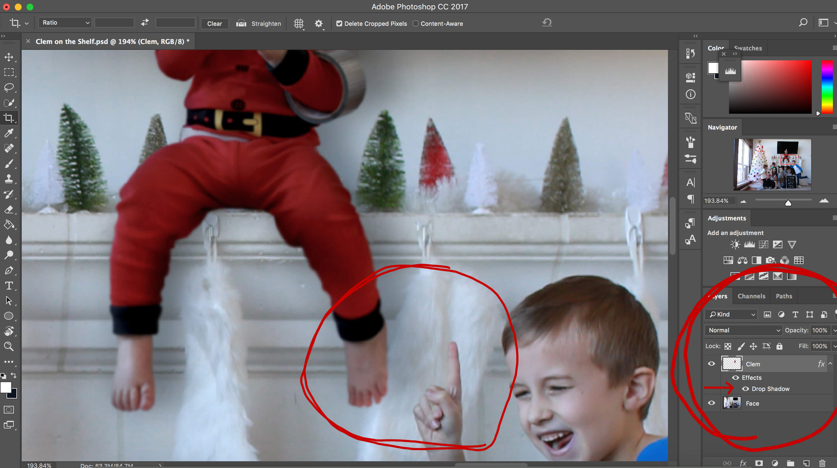
Click on any of the pictures in this post to see a full sized version to get a closer look at things, like the blurring comparisons of Clem and Liam in this example.
Also, notice the shadowing. Shadowing was one of the biggest take aways I had from this picture’s “failure points”. Up until this picture, I had only ever used a type of built-in “preset” shadowing that comes with Photoshop called, “Drop Shadow”. However, since this picture was a little more complicated and needing different spacings of shadows ( 1. barely any space between her legs and the ledge, 2. more space behind her back to the wall since it’s a bigger gap, 3. her butt doesn’t really need any since she’s sitting).
Needless to say, Drop Shadow wasn’t really working and I didn’t know what to do. So I tried making her legs darker… Yep, her legs. Because that makes a lot of sense, right? haha. Like when you, in real life, cast a shadow, it falls on yourself and not the background haha. I’m not really sure what I was thinking here. But after seeing how UN-natural this looked, I was determined to learn how to make it right.
Some Really Cool Photoshop Tricks I Learned
So over the next several days, I made it a huge priority to soak up as much juicy Photoshop information I could through Google and YouTube. The main points I wanted to learn more about included:
- Face Swapping
- How to effectively cut-out people/objects from one image so I could place them in another.
- Proper Shadowing techniques
The great (or bad) thing about graphic design, or really a lot of things in “The Arts” field in general, is that there are so many ways to do the same thing. I would watch multiple videos covering the same topic from different teachers, and soak in the information all coming from different angles and then mold my own way of doing what worked for me. So here are some of the highlights to what I learned.
Face Swapping
The concept behind “Face Swapping” is so beyond-words amazing. I can’t even put into words how awesomely powerful it is. I also can’t believe Jessica and I have gone all this time without me knowing how to properly do it.
The “absurd” uses for swapping include things like making your Clem on the Shelf swing around on a hanging light fixture, or making it look like your Christmas tree is falling over. Some of the more practical uses would include placing a kid into a picture when he wasn’t actually there, or when your wife says, “I like the way I’m standing in this picture, but I like the way my hair looks in this picture”, or quite literally face swapping the best expression from someone into a different picture.
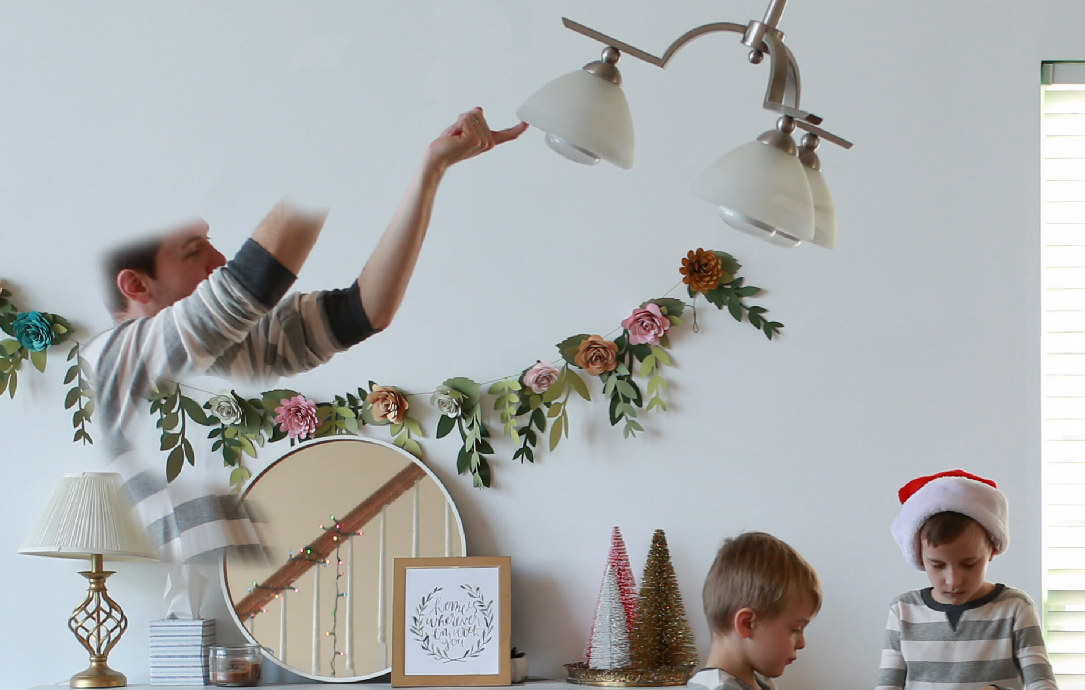
I can still feel that “magic feeling” inside of me as I look back on these pictures and remember how amazing it was to learn about this for the first time. I was absolutely blown away by the power of “masking“. I’m seriously kicking myself for not learning how to do this earlier. I don’t even want to think about how many family pictures that could have been saved over the years by knowing how to actually pick and choose which faces of each of the kids (and us) to use for the final render.
For the Clem on the Shelf pictures, masking was primarily used to edit me out, like when I was holding Clem by her hands, or holding a light fixture, or a tree. And in case you’re wondering, I did actually use it to swap a few faces here and there too haha.
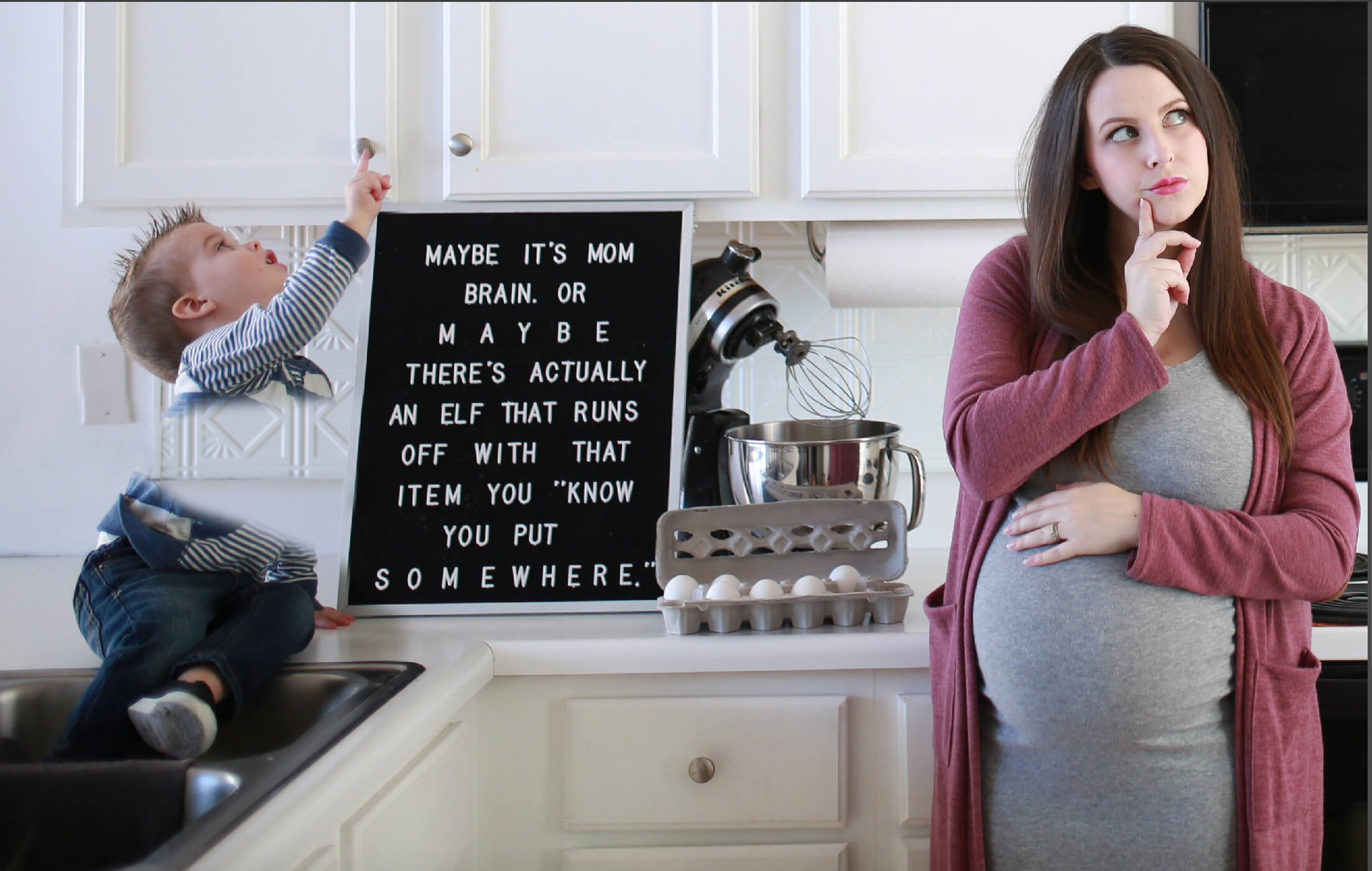
What “masking” does, if you’re unfamiliar with Photoshop, is basically this: When you have two images that have identical backgrounds and they are lined up and in sync with each other -either by using a tripod (way easier since the camera is in the same position) or by hand and making sure the camera is in roughly the same place and angle (way harder)- it will allow you to “paint out” the image on top, revealing the picture below.
For example: In that picture of Jessica and Des up there, Jessica liked her expression in the picture that had no Des, but she wanted him to be in the picture. So we found a picture of him from that same photoshoot, overlaid it (underlaid it?) underneath the picture of Jessica, lined up the backgrounds (cabinets), and painted Desmond into the picture with Jessica.
If everything is perfectly lined up, it’s a piece of cake to add in a kid, or subtract a dad. Super-duper cool.
Better Cut-Outs
This one I didn’t really learn until near the end of the series, but I felt like it gave me a much cleaner cut-out of Clem when I learned what I was doing. It’s kind of hard to explain through a blog post, so you’ll just have to take my word for it that there are some options inside of Photoshop that I didn’t know how to use correctly until watching a YouTube video on it.
But anyway, my cut-outs of Clem went from being really unnatural in the beginning, to looking a lot more natural..so.. uhh. yeah. This section is kind of boring ha. So on to part 3!
Shadowing
This section is another one that blew me away when I decided to step away from my comfort zone – A.K.A. “Drop Shadow”. After watching a really long video that went from start to finish of a completed composited picture, I learned that one of the things that this particular designer did, was he painted in his own shadows. This seemed kind of interesting to me so I decided to try it out for myself and was super impressed with how much more real it looked this way.
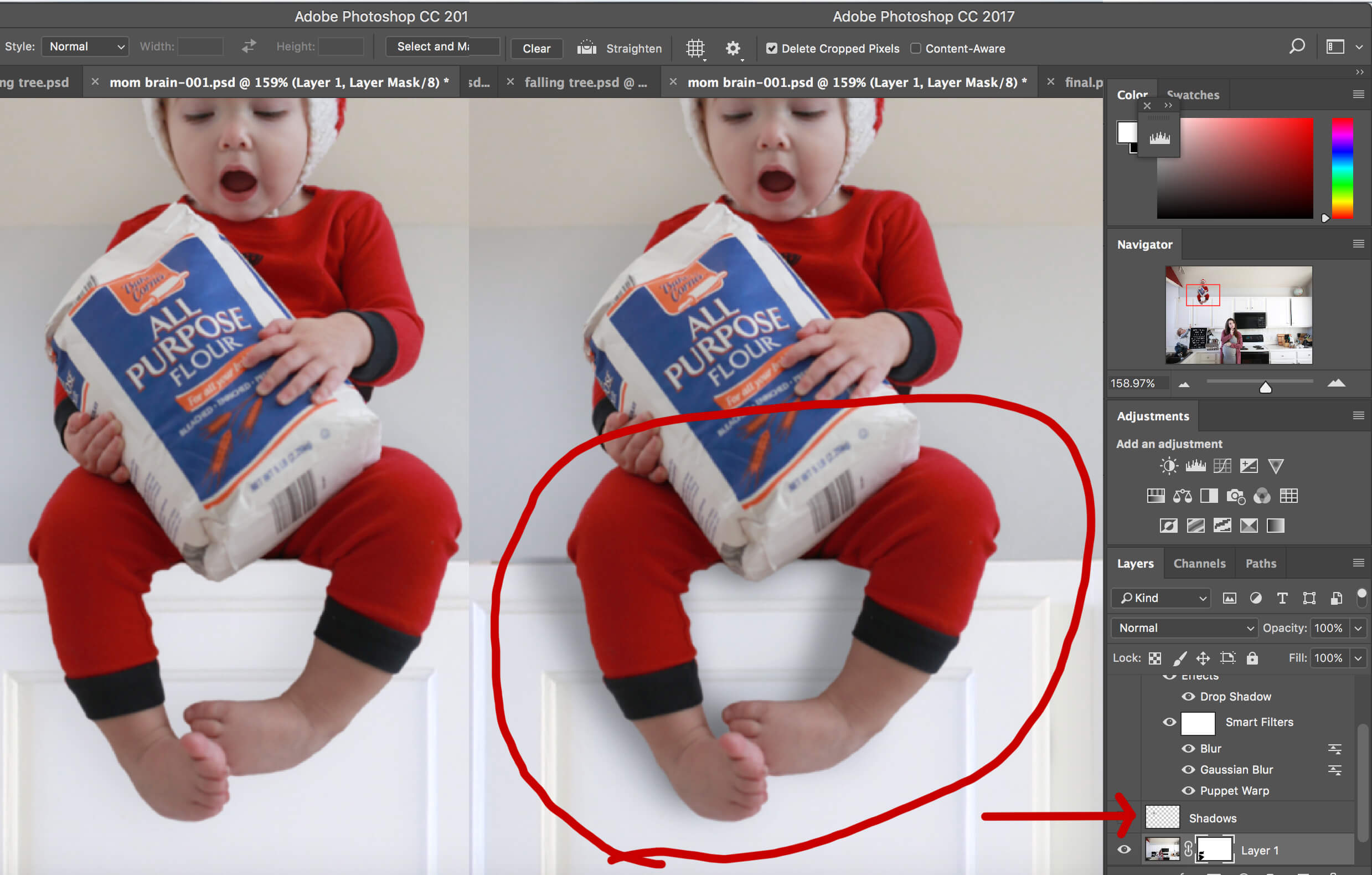
What he did for his composites was create a layer specifically for the shadows, and used the “eye dropper tool” (a color finder) to find the color of the object behind the thing you want to make a shadow from. In this case, I used the eye dropper tool to click directly by her legs to get the exact white color of the cabinet. Then I painted on a shadow with a really light and soft brush, and used a layer mode called “Multiply” which basically darkens the white into a black.
Example: If I was trying to make a shadow on something like an orange wall (random), I would use the eye dropper to get the orange color from the wall, make a new layer and paint that orange behind the person. Then by setting that layer to “Multiply” it changes the orange to a darker version of that same orange. Like a shadow would actually be. A darker version of itself. Not just black.
This is now my new favorite way of creating shadows because I actually have control over the shadows now. If her foot is close to the cabinet, I paint really close to her foot because there isn’t as much space between her foot and the cabinet. As her knee is coming out away from the cabinet, the shadow moves further away from her leg and gets softer. It’s a super cool technique and one I’ll be spending a lot of time perfecting I’m sure.
Some Final Crazy Stuff
The way we got Clem to be in different positions were either by holding her, or having her sit on a little chair. But sometimes parts of her body were covered by my hands or the chair, and I had to improvise with “filling in the blanks”.
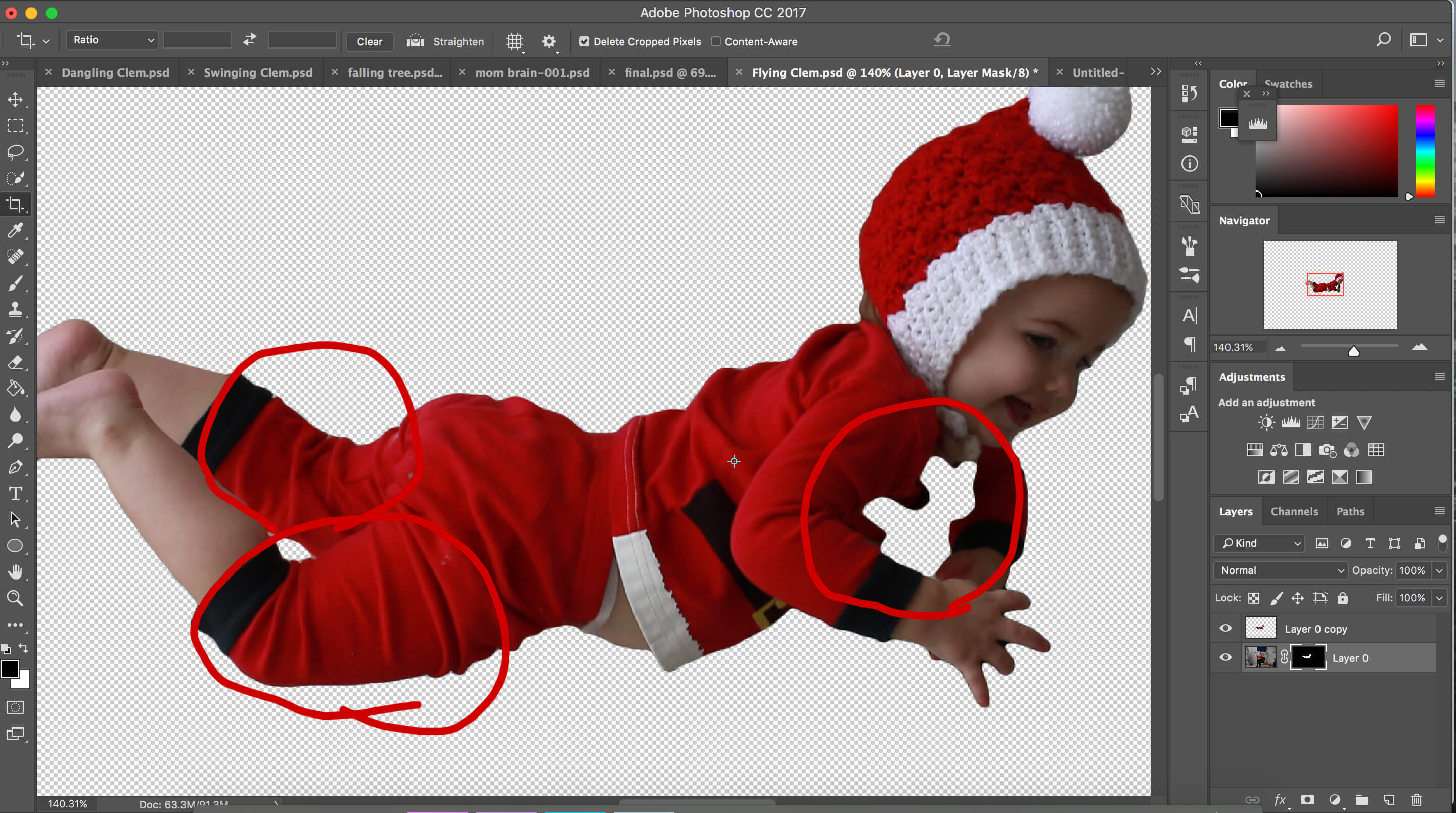
In this picture, I was holding her in a way that made her look like she was floating in the air. The problem was that my hands were blocking parts of her chest and arm, hence that weird empty cut out on her. The way I fixed this was I just made copies of her legs and filled in the holes with the edges of her copied legs haha.
I did something similar with the swinging picture as her left leg was being covered up by the chair she was sitting on. So I literally copied her right leg and stuck it on there as a left leg haha!
One last cool thing that Photoshop helped us with on this series was sometimes we had really long letterboard phrases that left us needing some extra letters. It was pretty easy to just copy and paste a single letter from a different spot on the board to fill in a missing letter when we needed it!
Conclusion
Thanks for sticking with me on this super long post! I know a lot of you were really curious about how we pulled off these pictures, and were wanting a sort of practical guide to how we used Photoshop. While I know I didn’t really make a tutorial on how to use any certain features, I hope that I at least explained what some of those really cool features were and now you can better understand how certain edited pictures are put together.
If you have any questions about anything, want a more detailed explanation on something, or maybe you actually are a Photoshop expert and can give me some pointers for the future, leave a comment below and let me know!